Introductions
This is a rough transcript of a talk I gave at SXSW on March 13th, 2010. It’s reconstructed from my notes and slide-deck. Enjoy!
Also: SXSW has posted the audio from my talk. In the right column, under the map. Peter at FirstFlight has also posted a couple of photos and cool graphical notes he took.
The people are speaking!
"Josh, I saw your talk at SXSW and thought it was the best one of the whole event - really enjoyed it, and lots to take away for work and for myself." (Source)
"One of my favorite presentations from SxSW" (Source)
Without further ado...
Hello!
I’m Josh Knowles. I’m an independent developer-designer from New York City — though I’ve lived in Austin most of my life. I work on various social, mobile, and game design projects. I’ve been working professionally with the web since 1996 and launched my first truly social media site — iLoveFreeWifi.com — in 2002. Over part few the years I’ve diversified out into a really wide spectrum of projects. For example, I created a public screen gaming platform called PhonePlay which has been installed and played all over the United States and world. Sprint and Nokia are two of my recent clients with that. I developed a text messaging platform called Mo7 for Studio IMC which currently has 100s-of-thousands of users. Numerous clients use Mo7 for a variety of things — including games. With my friend Matthew Burton I’ve developed several web applications including ACH, a social data analysis and forecasting application; GlobalEESE, a research-sharing site for the US Department of Energy; and HarvardShare, a similar sort site for researchers at Harvard. More recently I’ve been working with Columbia University’s Games Research Lab on a mobile phone game called Lit designed to help people quit smoking. And I’ve got several iPhone projects in development including apps for Thrillist and Consumer Reports. I’ve also developed social games for MTV and mtvU, amongst others, and recently launched Mojito, an umbrella for a variety of upcoming game development projects.
So. The common thing about all of these projects — about any interactive media project — is this:
How do you get the person to do the thing?
How do I get the person to call into the PhonePlay game? To upload a research paper to GlobalEESE? To sign up for Thrillist’s e-mails? To quit smoking by playing a game? How do I get you, my user (or potential user), to do that?
There’s tons of user experience design research out there. Obviously. The problem I have with a lot of this research, though, is that it begins to feel like a bunch of dry recipes for reducing mouse-clicks, arranging menus, and preventatively not confusing users. If you’re not familiar with Jakob Nielson, he kind of represents an extreme of this kind of attitude, to me. Check out his site at useit.com and you’ll see what I mean. Usable. But dry.
I make a little fun of Kathy Sierra sometimes. She has a tendency towards cute little graphics and flourishes like her random puppy slides. But. I do give her credit for her focus on not just making things usable but designing things to create a sense of passion in users. I get passionate about the projects I work on. They’re fun to make and fun to release into the world. So my natural tendency is to make things that people get a kick out using. I come to technology from a creative background. I studied literature and creative writing here at UT and spent many years swimming around Austin’s digital art and music scene. So: I believe that even seemingly mundane projects have the chance to be expressive and innovative — and if not thrilling, well, at least enjoyable to use. Maybe even fun. Something that will make people happy. And I believe that this attitude isn’t just an excuse to add bells and whistles — there’s good evidence that people do whatever they’re doing better when they’re enjoying themselves.
So this is where I’m coming from as both a designer and as a developer.
I’m also a gamer.
Which is from where the this talk draws inspiration. One thing I’ve noticed lately is how game design elements have been working their way into some odd places. You’ve seen American Idol, no doubt. Or at least heard of it. Pop music reformatted as a game. Seemingly every country on Earth has a show like this right now. A couple of years ago the most popular TV program in the Middle East was something called Million’s Poet, a show like Idol but starring Bedouins reciting ancient forms of poetry, competing to win votes and prizes. A poetry game.
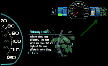
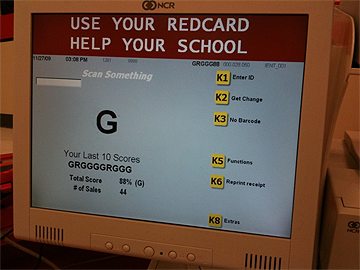
And speaking of American Idol, have you seen the ads with last year’s winner Kris Allen hocking this? The new Toyota Prius has something called “Efficiency Leaves” — little leaf graphics on the dashboard you earn by driving efficiently. Save gas. Get points. This stuff is showing up everywhere once you start keeping an eye open for it. Here’s another — a photograph of a checkout terminal at a Target store. Employees are given letter grades and an overall score depending on how efficiently they check people out. This person’s apparently got a score of 88%.
And it makes sense, right? Everything’s becoming more interactive. And everything’s becoming more interactive across huge distances and involving more people and just all sorts of data about us and what we like and what we do, etc. As people in general are given the opportunity to interact with media and data like this, it makes sense that interaction designers would look for inspiration to those people who have been exploring enjoyable interactivity since antiquity: game designers. As an aside, this is also the core of my argument that interactive media educational programs must have solid game design courses. Game design is a hugely important part of the larger field of interaction design that often gets overlooked.
So that’s what I’m going to get into here. Elements of game design are also showing up in social software — which is what, because of my vocation, interests me most. People are beginning to talk about this more, but I don’t think they’re talking about it enough. Honestly, it’s still treated mostly as a novelty rather than a core tool of interaction design. So I’m going to go through a bit of my thinking on the subject — and hopefully maybe inspire you to take some of these ideas and think about how they might apply to whatever projects you may be working on.
Games and Social Media
Games are engagement engines. To design a game is to take some thing — some basic enjoyable and/or satisfying interaction — and carefully apply rules to help players maximize the enjoyment and/or satisfaction they have with that interaction. Just kicking a ball around can be fun. Kicking it hard. Kicking it at things. Running after it. But by wrapping this playful activity in the rules of soccer — put players on teams, give the field boundaries, set specific goal zones, and such — you get a complex and challenging game which billions of people find meaningful. You’ve maintained the integrity of the core playful activity, kicking a ball around for fun, but you’ve also juiced it up and made it much more engaging and powerful.
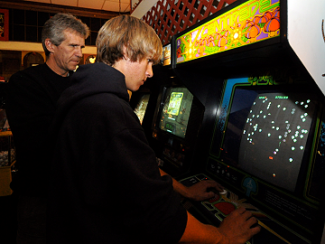
Computer games do this, too, of course. Classic arcade games, for example, are all about taking those little weirdly satisfying interactions and applying a few well-placed rules to pump up the excitement. Would Pac-Man be any fun without the ghosts? Would Centipede work if you never died? Not as well. Because while eating pellets and shooting up digital bugs may be fun for a little while, players need these ghosts and lives and such to create a sense of challenge that make the gameplay meaningful and will keep players hooked for longer periods of time.
Most games sort of by definition have “useless” interactions at their core. For example: Kicking the ball around. Eating glowing pellets. Recalling random bits of trivia. Shooting up some dude in a first-person shooter. Driving a car really fast. Caring for something like a virtual garden or a virtual city and making it grow. I could go on. But I think what interaction designers are slowly realizing is that they can swap out this “useless” thing with something useful.
For example: Spotting and labeling galaxies in super hi-resolution images of the night sky. Or identifying solar flare-ups in real-time.
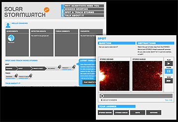
A company called Zooniverse has actually turned both of these activities into games: GalaxyZoo and Solar Stormwatch. GalaxyZoo has players cataloging galaxies. Solar Stormwatch has them watching for solar anomalies which might affect things such as satellites and astronauts. In order to play, a player must first learn the rules — which happens to involve learning about various elements of astronomy like: What does a galaxy look like? And this isn’t just textbook astronomy — this is the real stuff. Functional astronomy. In Solar Stormwatch, players must learn what is an actual solar explosion and what’s just a reflection or a comet or something else. They then earn points and badges by observing this real data and making observations which prove accurate. And players level up: As you earn more points, you open up new sorts of data to process. So. Wrapping game design elements around these takes what might normally be considered tedious data-processing tasks and makes it both fun and educational for the community at large. And, check out this quote from their site:
Actual scientific advancement from a game. Amazing, right?
(If this interests you, you might also want to check out Waze. They’re doing something similar, but with street maps.)
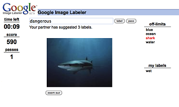
Google’s Image Labeler game is another relatively famous example. This launched a few years ago. Google has an image search, of course — but it’s notoriously hard for them to identify what a given image may be of. To help with this, they released this game. Two users play cooperatively. An image is shown and both are asked to tag it — but they can’t see one another’s tags. So. When the players match tags, they get points. And Google, then, has a pretty good idea that the tag describes what’s in the image because two people have thought of it independently. It’s cross-checked, in a way. So Google has taken this, another fairly tedious sort of data-processing task, and by applying some elements of game design has made it fun for people to do — with a great side effect of actually helping Google improve the quality of their image search. Very cool.
InTrade and the Iowa Electronic Markets are another set of examples. Both turn the act of making political predictions into a simple stock market sort of game. By giving a price to actual outcomes — “Candidate X will in the race!” — players can make actual money by beating the conventional wisdom. And what’s amazing, here, is that these two games have turned into remarkably accurate predictors. Both InTrade and the Iowa Electronic Markets have taken some basic activity — political predictioneering — and added some well-thought game mechanics — a stock market system — and they’ve made something much more interesting and meaningful and accurate.
More Examples
Using game mechanics to filter user-generated content is becoming much more mainstream, as well.
Slashdot pioneered this sort of thing back in the late 90s to help improve the increasingly unwieldy comment conversations that would occur below each post on their blog. The sheer volume of user-generated chit-chat on the site was way too much for their small group to moderate on their own, so during 1998 and 1999 they developed this concept of “karma” for users. Karma is a score given to a user based on the quality and quantity of their comments on Slashdot. Users with enough karma are given the opportunity to be temporary moderators, rating the quality of other user comments by giving out (or taking away) karma points. Slashdot created this sort of game to make sure the highest-quality comments were most visible on the site — but also to reward good behavior with a visible score and “unlockable achievements” in the sense that users with sufficiently high karma would get an extra comment-visibility boost and sometimes earn moderator status. And this seems to have worked for them. Despite the enormous mass of users, the quality of conversation on the site remains quite good.
I should note, also, that last year Slashdot introduced “achievements” — badges earned for doing different things on the site like submitting a story that gets posted to the main page of the site, checking the site a certain number of days in a row, or having a particularly high-rated comment. They don’t publicize what achievements can be unlocked — they leave that up to users to discover. While this doesn’t directly impact the quality of the conversation, it does add an extra level of fun and exploration to the site.
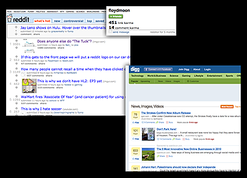
Many sites have imitated this karma system for filtering comments. Reddit and Digg are two of the highest-profile examples — we see their little “Reddit this” and “Digg this” badges all over the place. Both the front pages and the comments sections on these sites are filtered by this score — generally-speaking, the more positive votes something gets, the higher up the list it goes. Like Slashdot, Reddit also visibly displays users’ karma scores.
StackOverflow is a newer site which has mixed up these ideas of reputation score and achievements in a different way. StackOverflow is a question-and-answer site, similar to Yahoo! Answers or Ask Metafilter, but with a focus on coding-related question. Someone submits a question. “How do I make a drop shadow in CSS?,” or whatever. Other users write up answers and one is voted the “right” answer and is highlighted in the comments. When someone votes up your question or comment, you get reputation points. Earning reputation allows a user to unlock new moderation powers. At 15 reputation points, they can vote questions and answers up. At 100 points, they can vote down. At 200 points they can view the site with fewer ads. At 10000 points they can delete closed questions. Etc. It’s a powerful way to bring active users more tightly into the site and to reduce management overhead by giving power-users the abilities to take over certain moderation tasks (and other things). It also gives a nice numerical indicator of the amount of social capital one has earned on the site.
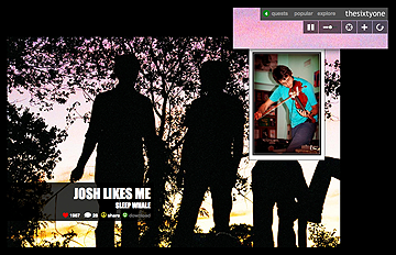
The last site I want to look at here is TheSixtyOne. This is a new one, launched last year. TheSixtyOne is a music filtering system. The site streams music as a radio station might. (The song in the image to the right is, by the way, actually the song that first played when I went to TheSixtyOne to get a screenshot. Weirdly, the title of the song is accurate. I like it! How did they know?) Anyway — as you can see, the site allows users to “heart” favorite tracks and gain reputation points for certain activities. For example, if I favorite a track that’s playing that I really like, I will gain reputation points down the line for each time someone else favorites that track. The idea being, if I’m consistently ahead-of-the-curve in pointing out the best tracks on the site, then I deserve a good reputation for my good taste in music. Reputation points help quantify that. Users are also given only a handful of hearts to favorite things with when first joining the site. If you want to favorite more tracks, you have to earn more hearts. TheSixtyOne also offers “quests” as ways to get more reputation and hearts. These are both introductory and achievement-oriented. For example, one quest for me is simply to listen to seven songs from my personal stream that the site creates for me based on my tastes. Clearly, TheSixtyOne is hoping that adding these elements of game design to the music listening experience will make the activity much more interesting and enticing to their users. We shall see!
Location, Location, Location
I want to quickly take a look at a three similar location-based check-in apps: FourSquare, Gowalla, and MyTown. Though they’re similar at their core, they each apply game design in a unique way.
I think we’re all pretty familiar with generally how these work: You go out somewhere and “check-in,” essentially broadcasting to all of your friends and followers, “Hey, I’m at Emo’s!” or “Hey, I’m at Stubb’s!” or “Hey, I’m at this awesome SXSW talk at Austin Convention Center!” Maybe this is broadcast out to Facebook or Twitter, as well, but when you go into the app (or the website) you get a kind of dashboard of where your friends have checked in recently. Easy.
FourSquare adds two main game mechanics: Earning mayorships and achievement badges. By checking in most often from a location, a user becomes “mayor,” sometimes earning bonus items like a free drink from the location itself. Not only does the possibility of becoming a mayor incentivize checking in, it also gives users an odd sense of ownership over both the app and the venue they’re mayor of. There’s a certain celebrity attached, as well, depending on the place. The badges are another fun item. As with Slashdot, it’s not exactly publicized what it takes to unlock a given badge, so there a bit of a pleasant surprise when you get one. FourSquare also, of course, has points. All of these check-in apps do.
Gowalla uses a stamps collecting mechanic. When you open the app, the most prominent element is a collection of little images — the user’s stamps. When checking in, the user is given the opportunity to swap out items — trading a beer item for a chips-and-salsa item, for example — and using these to do different sorts of actions in the app. Users also earn stamps and pins — achievements — for doing different activities like checking in in different states.
MyTown pushes the game element of check-in apps to the extreme. It’s much more of a Monopoly-like game — by checking in users earn the ability to “buy” locations — which is sort of similar to becoming a mayor in FourSquare. Except after buying a location, a user can earn in-game money by charging rent whenever someone checks in there — this money can be used to make upgrades and get various “power ups.” The home screen of the app features a graphic of this little town that the user is building. I honestly find this to be a bit overwhelming for a check-in app — MyTown really does kind of drift back into the category of being just a game, especially since one flaw, I feel, is that it heavily incentivizes false check-ins by making a check-in so valuable. You can game FourSquare and Gowalla, of course, but because game design is more of the frosting on their social cupcake rather than the cupcake itself, there’s more social pressure not to.
A Design Toolbox
The sites I’ve just gone through are of a fairly wide variety. A music site. Some social broadcasting apps. A couple of science games. Some discussion-based sites. And such. But they all basically use the same few game design elements.
First: Earning points. Whether it be reputation points, fake money (or real money), or just a number — people do seem to like points. Especially public points. Designed correctly, a points system is a way to quantify the behavior you as a designer want to elicit from your users. Most of the examples I’ve shown offer variants on the “high score” kind of points system, but I should also mention apps like resume-sharing site LinkedIn and the social reading site Shelfari which use a score to introduce to users the tools available on those sites by giving each user a “percentage complete” score. If you’ve only given them your real name but haven’t added a photo or any friends, your “percentage complete” score may only be 25%. The important thing to keep in mind (as with all of these elements I’m about to go through) is that they be understandable and that they be structured in such as a way to coerce the best results. So. If two actions contribute to a score, make sure the more valuable action is worth more points. Seems obvious, but there you go.
Second: Earning badges and achievements. These are similar to points, but are structured around the completion of specific defined activities. They’re very common and addition to being fun on their own (when done right), they can help guide users through different uses of the application and they can allow users to have profiles with a bit more personality — badges can have cute names or graphics and when users use the service in different ways, they can pick up unique collections. Looking at someone’s FourSquare badge collection can tell you bit about them. Also, as with Slashdot and FourSquare (and many, many XBOX and Playstation 3 games), badges can be left mysterious so that users either have to guess as to what it might take to unlock — or explore the application and maybe communicate with other users to figure it out. Which can be a great way to boost involvement and have a little extra fun.
Third: Earning unlockables. These are usually a consequence of one or both of the previous items — the ability to earn the power to use the site in new ways or gain some access usually reserved for moderators. As in StackOverflow and Slashdot, these are a good way to make power-users helpful to the site — and a good way to drive usage with the promise of benefits. I really like, for example, StackOverflow’s unlockable reward of being able to use the site with fewer ads once you’ve acquired a certain number of points. It feels like a nice “thank you” for being a good member of the community.
There are two kinds of unlockables, I should note. Individual unlockables are the more common, but occasionally you’ll see global unlockables. These are rarer in social media apps — but they’re becoming a bit more common in games. Global unlockables are new things that become available to users when everyone using the service (or playing the game) collectively does something like earn a significant number of points or play a certain number of rounds. ARGs — alternate reality games — often use a mechanic like this where new pieces of information are revealed as the community as a whole solves problems. Like I said, relatively rare, but worth thinking about. Especially in situations where you want to manage expansion over time like during a launch.
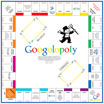
Obviously this isn’t an exhaustive list. It’s actually a really simple list — reflecting, I think, the fact that experience designers are only beginning to get their toes wet with this sort of blending-in of game design elements. There’s some really obvious stuff that hasn’t been experimented with very well at all. For example, game boards. Game boards are actually a great way to visually represent the state of an entire system of interaction at once — the current standing of the players, the possible actions they might take in the future, etc. Think of Monopoly or Chess. Could a social app use a game board to good effect? Maybe. What about games where different groups of players have different roles. Pictionary, for example. One player draws and others guess. Or Scotland Yard — which is a kind of board game version of Marco Polo in which one player must avoid all of the other players. These might sounds like weird things to apply to “serious” social software, but once upon a time 140 characters seemed like a weird restriction. The point is, this is just the sort of experimentation experience designers should be doing right now.
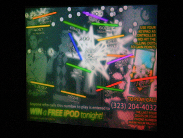
It’s actually interesting going through old board games and classic video games — it’s a good way to shake up your mind a bit when it comes to thinking up new ways of having people interact. And the game mechanics of popular old games can be so ingrained into our culture that almost everyone will recognize them pretty quickly. Everyone knows Pac-Mac. Everyone knows how Space Invaders works. Games I build for my PhonePlay phone-to-screen platform, for example, are often run in a loop with other advertising. In some cases I need potential players to understand how the game works within about 10 or 15 seconds. To the right is a photo of a PhonePlay game that works like Pong or Arkanoid, for example. Balls rain from the sky and you hit them with a paddle to get points. Everyone understands this pretty quickly. (It’s hard to tell, but this is actually projected about 12 feet tall in front of a few thousand people at a concert venue.) Anyway: Mining game mechanics from old board games and coin-op arcade games — or popular sports, for that matter — can be a great way to help users quickly understand the game. So I would suggest this approach for social media services, as well, in which you may have only a few seconds to educate a new user about how your thing works before they flit off somewhere else.
Effects on Users
We can use these and other game mechanics to achieve certain particular effects on our users.
For example, education. It’s a well-worn theme that games are excellent teachers. Interacting with something, directly manipulating it with some goal in mind — the brain loves working with systems like that and figuring out how they work. Many console games are rather complicated, for example. You have, like, twenty buttons on your controller and few really intuitively match the action on the screen. Why does hitting “X” make you jump? Who knows. So game designers on these platforms have to integrate education into the game design — and it works pretty well. If you’ve played Portal, for example, you know how Valve gently introduced their new and really strange game mechanic — the portal gun — slowly over the course of the first few levels. By the middle of the game you’re an expert at it and really thinking creatively about the puzzles in the game. Coming back to social media, this is what TheSixtyOne is doing with their quests. The quests aim to educate the user about the different offerings available on the site. Maybe I’m not aware that there’s a personal music stream waiting for me. If I see it in my quest log, though, maybe I’ll check it out. Maybe the different mood-theme streams they offer don’t seem interesting to me. If I see I can earn ten hearts and some reputation by trying a few out, maybe I will. And maybe I’ll actually enjoy it. So one way to think of these game elements is as a guide for users to introduce them to the site.
Another effect is giving users an explicit invitation to participate. These game elements, as I’ve explained, are incentivizers — ways to nudge users towards certain actions. They’re also a means of communicating to users what you, the person who runs the service, are looking for from them. StackOverflow, for example, very clearly announces that they’re so excited to have a new user chime in on their site that they’ll even eventually give that user moderator powers if they do so and keep participating well. Users also feel more comfortable when given a table of options when someone can make a suggestion the way a good waiter might: “To get started, maybe you should try out option A and see if you like it.” Not because the user is being forced into it, but because they need a launching off point. A well-designed game mechanic can do this.
3rd effect: When users feel good about what they’re doing, they tend to be more open and creative about it. Donald Norman writes about a study in his book Emotional Design: “[Psychologist Alice] Isen discovered that when people were asked to solve difficult problems,” Norman writes, “ones that required unusual ‘out of the box’ thinking, they did much better when they had just been given a small gift — not much of a gift, but enough to make them feel good. When you feel good, Isen discovered, you are better at brainstorming, at examining multiple alternatives. And it doesn’t take much to make people feel good.” So if you’re looking for a way to help your users embrace your service, offering up little rewards and pats on the back — even virtual ones — can be a great way to do it.
Pitfalls
So. There are pitfalls in this!
For example, if you’ve decided to use a points system as a way to let users compare and compete with one another, be aware not to use points in a way that will distract users from what’s most important in your service. For example, there was recently a discussion on Metafilter — a popular and very well-run group weblog community — about the issue of tracking the number of delete comments a user has had. “…Could we have a count of our deletions somewhere on our profile page?,” one user asked. “Anything that puts a number on [bad] behavior is a bad thing, we’ve found,” replied site owner mathowie.* Putting a number on something will incentivize a certain number of users to achieve a high (or low) score doing that thing. If you don’t want to promote comments that need to be deleted, you shouldn’t give points to someone when you delete a comment. Metafilter does, though, show how many people have “favorited” any given comment — and users can view their master score of “favorite” flags people have given them — a motivator for positive participation.
Another pitfall is using a game mechanic which oversimplifies what’s important in your service. Using points to organize comments in a political discussion, for example, can cause problems if users down-vote comments not because they’re bad but because they are politically disagreeable. Instead of contributing, users with a certain viewpoint may just clam up entirely.
Related is the issue of gaming the system. Any social app of size will attract users who want to misuse it or fuck with it. Scoring, leaderboards, badges — anything automated which can allow a user to prominently display himself or herself on the site is a target for this. One of the reasons that this sort of game design can be difficult is that ideally you want whatever rules you come up with to make these achievements only achievable via the positive behaviors you’re looking for as a designer. Putting yourself in a position of having to specifically remove a troll from a high score listing, for example, can not only give the troll a sense of satisfaction and extra publicity, it may also confuse or aggravate your other users and possibly require a more detailed explanation in order to maintain their trust. Best avoid this.
But! While guiding your users gracefully towards certain behaviors, you need to make sure to avoid blocking users from expressing themselves fully on your service by exploring and possibly innovating new ways of using your service. We’ve heard so much about how sites like Twitter have grown so well because they’ve remained flexible to modifying the service to users needs. If you lock your users into a certain set of behaviors, you may lose this ability to change with them. So. Along these lines, you might consider using game mechanics that allow your users an “out” — the ability to use your core service well while basically ignoring whatever game elements you the designer may have added. I can use Twitter, again, as an example: Many people view the number of followers they have to be their “score.” And this is fine. It’s a motivator for a certain kind of behavior. (Good or bad? That’s a debate.) But. A Twitter user is totally allowed to ignore this “score” and define their own scoring system for Twitter. Like the number of retweets. Or the amount of traffic it gets for their blog. Or maybe they just want to say silly things to their friends on occasion and they don’t care about any kind of metric. Your user base needs the elbow room to nudge the functionality of your service in different directions. Give it to them. Don’t make them have to elbow through your game.
Finally, you don’t want to complexify your service to the point where users have a difficult time understanding what’s going on. As with any user experience design, each element must be only as complex as it needs to be to work — and extraneous elements should be cut entirely. Clutter is clutter. Whether it’s visual design or game design or whatever. Throwing too many points, badges, this-that-and-the-other at users can turn them off.
* I know, adding "bad" changes the meaning of what he actually wrote. My interpretation of the conversation is that he accidentally omitted the word. At any rate, I think the spirit of the conversation backs up the lesson I've drawn from it.
The Big Picture
Okay. So, let me just end on an uptick with three big reasons why I think this subject is important and why I think all user experience designers and interaction designers should become more experienced as game designers:
1) Games can increase user enjoyment which can make your users better users. You can educate them about your service — or about something else entirely like galaxies or cool music — in a more engaging way. You can give them a sense of fun which will not only keep them around but it’ll make them more likely to forgive your mistakes and explore and think creatively about using your service.
2) As the number of social apps grows, so will the need for these apps to differentiate themselves from one another. Game design is certainly is one way to do that, as we see with FourSquare, Gowalla, and MyTown. And, of course, as time passes more and more of your casual activities will be trackable. Scary, maybe. But it is coming. Knowing how to create new ways to use that data and reflect it back to the user in a way that they appreciate and have fun with and may even help them learn more about themselves or their friends and maybe change their behavior in some way — these will be extremely important skills to have in the future.
3) Until fifteen or twenty years ago, techniques for collaborating between large numbers of people have been few. We’ve got voting and various parliamentary procedures, but not much. But now this field is blossoming and I think that as we learn more about how people collaborate, coexist, and enjoy themselves is relatively low-impact social media sorts of sites, the more we’ll learn about how people can collaborate and work together in bigger, more global ways.
So! Hopefully I’ve given you something to think about.
Thanks!
Further Reading
This isn’t a complete list, but here are a few interesting books and articles that influenced some of the content of this presentation:
Books
- Emotional Design by Donald Norman
- A Theory of Fun for Game Design by Raph Koster
- Rules of Play by Katie Salen and Eric Zimmerman
Links
- Jesse Schell, “Design Outside the Box”
- Game Mechanics for Interaction Design: An Interview with Amy Jo Kim
- Gaming the system: How moderation tools can backfire
- Mayor of the North Pole
- Metagames and Containers
- Ribbon Hero turns learning Office into a game
- Life on the List


